
My mother was once told by a school evaluator that her kindergartner had a “slight fine-motor disability;” I have never been able to color inside the lines, I am not to be trusted with dispensing superglue, and it takes me a few tries to put my house key in the lock. I suspect this generalized spatial-skill limitation is also to blame for my inability to visualize hypothetical furniture placement or an entire room painted in a certain color. (The Husband’s ample artistic skills have insured that we don’t live in a fun-house.)
So when Mitch unveiled our next project at my most recent Letterpress Class, I figured that I would be in my element – all we have to do is choose a font and set the type for the alphabet, plus numbers and characters according to our whim. No brain-wracking for clever phrasing or designs, just the basic 26+ characters that build the English language, all fit within an 8 x 10 frame.
Won’t you come and play with me?
Either the pronouncement of an inadequacy so early in my academic career has hobbled me, or I’m just naturally anxious when it comes to making even remotely artistic choices. Typeset the alphabet: how hard can it be?
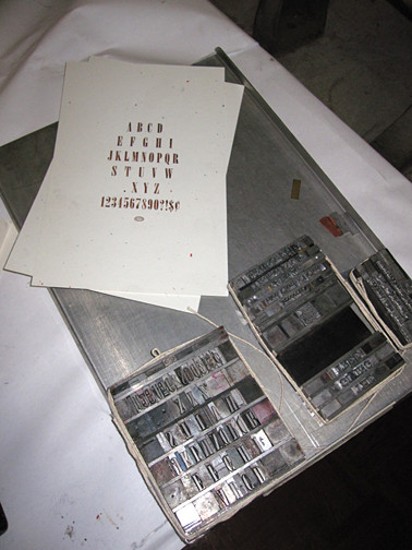
First, I choose a serif-ed font for its subtle dignity and ease of reading – Onyx. It is blocky yet narrow and I like it (plus, all of the alphabet is represented in the job case, unlike the first font I considered, then set aside when I realized that all of the H’s were missing). Composing stick in-hand, leading in place, I pluck the type from the job case and after the typical wild goose chase for spacing material of the proper point size, I settle down to typesetting…the alphabet.
Alphabet Soup
And then Mitch shows us a drawer full of print examples from previous classes. Letterpress artists of past laid out the alphabet with such cleverness – here is a periodic table-inspired layout, another upper and lower case alphabet rendering creates a pattern reminiscent of sound waves. This last one is a magical jumble of letters, numbers, borders, flowers, quirks, icons and blatant audacity; an alphabet symphony.
Meanwhile, I’m just trying to figure out how to properly justify 26 letters, plus numbers 0-9, and several symbols that when strung together look dangerously like cartoon-swearing.
Building Blocks
Coloring outside the lines is discouraged. The line clearly indicates your boundaries: keep your effervescent color on this side of the line, just like everyone else. I struggled for years, pressing hard on the paper hoping the pressure would control the color and keep it inside the line. All I accomplished was laying down a sheen of wax, and many broken crayons.
2 Ridic 2 Quit
I set my alphabet, number and symbol type and carry it to the ever-patient Vandercook (and the ever-patient Mitch) for proofing. I run my proof and there it is: The Alphabet. As inspiring as an eye chart.
Just then, into the Letterpress Shop strolls the artist who created the symphonic alphabet. He is a red-bearded young man who defines marching to a different drumbeat. By day, he is a Farm Education Coordinator, courtesy of AmeriCorps*VISTA, at a local farm that is a social enterprise of Foodlink. In fact, he carries with him their first tomato of the season, which he slices with a pocket knife alongside freshly pressed alphabets. By night, he is a Press Villain; bringing wake up calls to the masses via rocked-out letterpress prints.
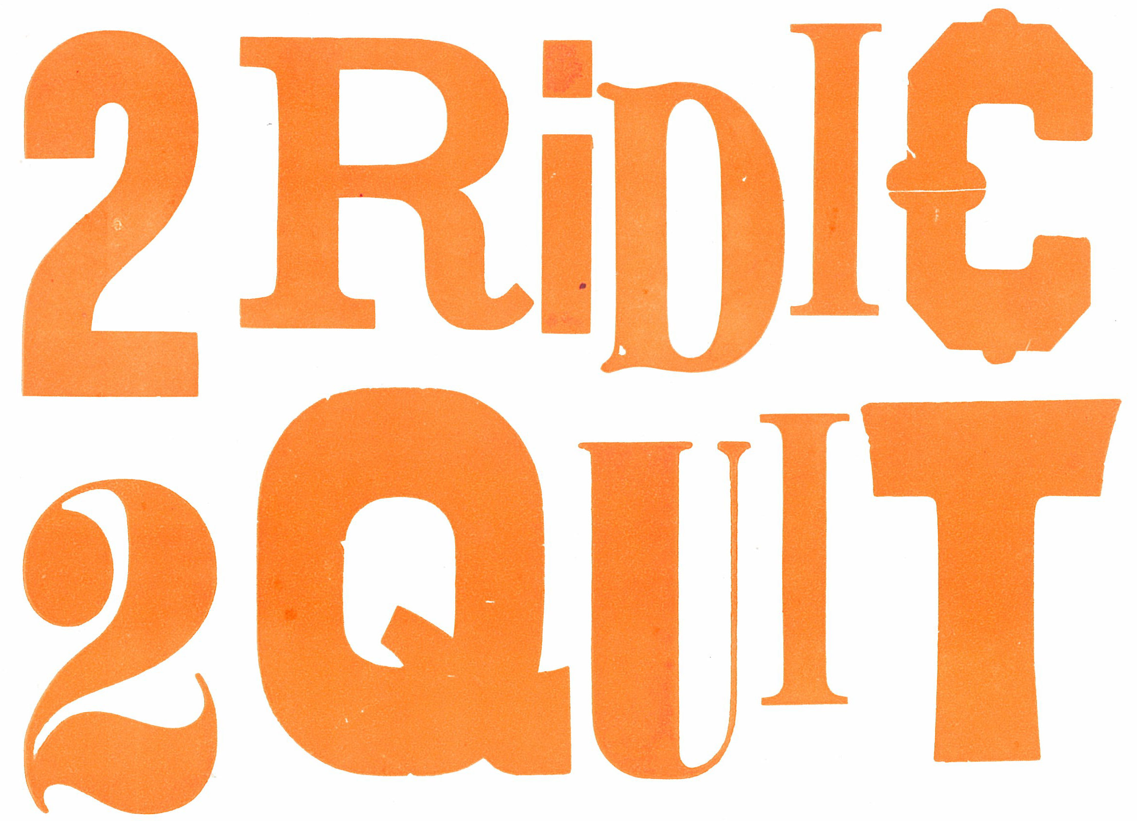
As I savor the first flavor of summer, he generously hands out copies of a Press Villain limited edition print, available for purchase here. The message is just what I need. I decide that at the next class, I’m going to pull apart my flavorless alphabet and re-set the type. I decide that I must proceed the only way I know how – by coloring outside the lines.
*Special thanks to the Press Villain for the tomato slice and my new mantra.


[…] last Letterpress project did not turn out as I had hoped. My Alphabet set in Onyx, plus numbers and symbols, was, I decided, about as exciting as an eye test. My classmates’ […]