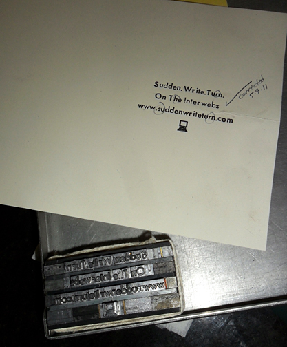
I had this strange dream where everything was both upside down and backwards, but somehow I still knew what was going on even if I couldn’t begin to explain it. Wait a minute…that wasn’t a dream, that was Letterpress class last week!
Put it into words

In the computer world, any good word processing program allows you to change the font with a few mouse clicks, from a lovely script with curlicues to your basic utility reading type. There are big fonts (think newspaper headlines) and small fonts (think newspaper articles and books), ornate fonts (think wedding invitations) and simple fonts (again, the newspaper). With MS Word, you can casually click through 75 fonts in a matter of minutes.
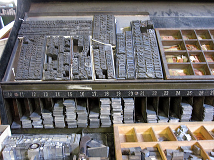
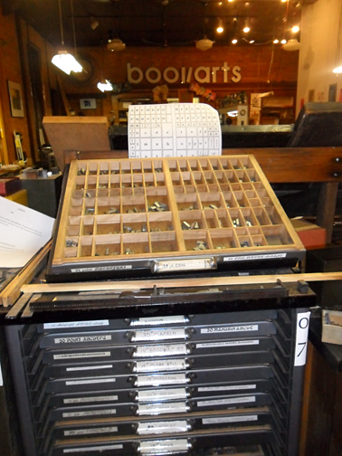
Not so in the grit and lead of the Letterpress world where choosing your font requires walking about the workshop to physically locate a giant, shallow drawer (the job case) where all the pieces of type live; lead pieces that come in chunks like tator tots and bits like matchsticks. And now you “set” the type in your composing stick one painstaking letter at a time. There is no “changing” your font unless you happen to be a masochist. Choose wisely the first time.
Get a grip

About four hundred years after Gutenberg brought us movable type, inventors began tinkering with typewriters. Oh, the typewriter – that dusty paperweight with the keyboard and carbon ribbon. If you have one lying around (haha, right!), peek inside. Notice how the letters are both upside down and backwards? When you are making an impression, either with ink applied to the type or though a carbon ribbon, that’s how the letters must be arranged. Upside down and backwards. Same premise as letterpress.
First, you grasp your composing stick in one hand and add a “slug” (a strip of lead similar to a stick of gum) for a base. Use your thumb to hold the type in the composing stick as you go along, adding each letter until you have your words/phrases/sentences. Easy, right?
Hunt and Peck
Mercifully, typesetting still flows left to right just like reading, and the type pieces have a “nicked” edge; as long as all your type is arranged “nick up,” your print will come out right side up. There’s no trick to deciphering the “backwardness” of the type itself except that your brain will just know, mostly. Nevertheless, lower case b, d, p and q will mess you up for sure.

I use a cheat-sheet chart to help locate the type in the case and start out looking at every piece to make sure that what I have is really what I want. I soon tire of that exercise and want to just trust that the drawer matches the chart. Don’t do that. You won’t know if the Y and Q type is opposite of what the chart reads until after typesetting is complete, the ink is applied, and your proof comes out looking really weird. Trust me.
Arranging type in a composing stick is probably a fantastic brain exercise, but it can be as mind-boggling as a six year old’s explanation of how to play an ancient game; I’m pretty sure that I’m hearing all the words but maybe I really speak Chinese.
Deus ex machina
My type is set, leaded, justified and on the press bed for proofing. I apply ink with a tiny brayer (like a tiny paint roller), center my paper, hand crank the press, and…something’s wrong. Some of my letters look funny. Lowercase, yes, but italic. Given that the type face is about 3 millimeters tall, you’ll forgive me for not noticing.
Should I find the proper job case and redistribute the italics type? No, these go into the Hell Box, a jumble of mismatched type pieces wallowing together in a leaded purgatory. A printer’s devil may someday submit to that sorry task of redistributing all that mismatched type while jazz standards waft through the air. With the most recent Judgment Day come and gone, the GCAE printer’s devil has over a year until the Mayans punctuate our existence. I suppose if that’s the case, why bother?

Next time: More jazz and wordsmithing

